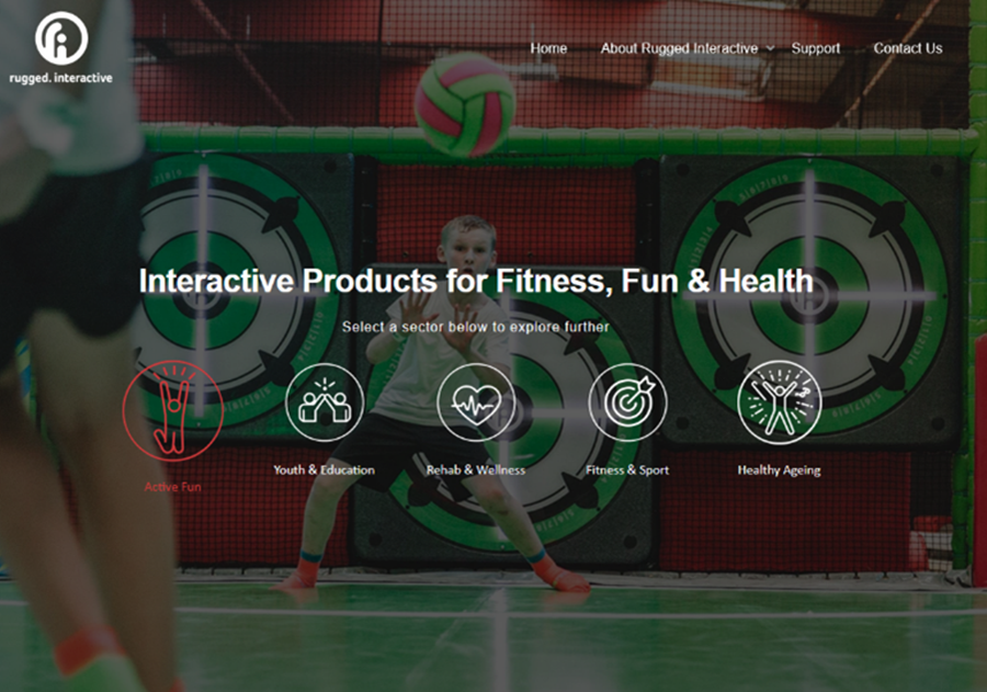
OK, so we have a new website – why should you care?
Good question. Companies refresh, remodel, remake theirs the whole time, correct. But for us, this wasn’t just because we felt we should, we absolutely needed to.
Why? Three big things; speed, navigation and confusion. Three big things that done well, keep visitors happy and informed, but done badly, can lead to frustration and the all-important action of just pressing ‘X’ to close the webpage down.
The ‘Other’ Three Second Rule
We can get almost anything with the click of a button these days. We expect everything to be instant. Instant results, instant answers. The same goes for scrolling social media and webpages – we want it now, and we want it to be easy to understand.
According to research by Google, over 50% of users leave a site that takes longer than three seconds to load. That’s three seconds to grab someone’s attention and make an impression so they stay and scroll. That was our marker.
The Navigation Confusion Cocktail
Our main aim is to help our customers understand what we do, and how we can help them. This means ensuring that every visitor to the website knows where to click to find what they want, and knows what to do to find out more. Our original ‘customer journey’ through our old website had enough pit stops to confuse even Lewis Hamilton – so this was a big thing to focus on.
Rugged’s roots are in Olympic sport and the notion of marginal gains in elite athletes. Our Founder, Simon, believed the inner motivation of elite sportspeople could be brought out in all of us through the power of gamification – which is why all our products give users a score or a time they can come back and beat.
Our flagship product, the CardioWall®, was first installed in gyms and leisure centres, but soon took off into retirement homes, schools, hospitals and trampoline parks. There born, our big dilemma.
How could we ensure that a health professional from a brain injury clinic didn’t leave our website after seeing a video of someone walking a wall on WallRider at a trampoline park? How could we shout, “you’re in the right place,” without having to instantly show our products in tens of different sectors when they arrived?
The solution, we split it up. We made five core sectors and with that, five mini websites within our big orange Rugged one.
Sometimes, it can be hard to believe that one product range can benefit everyone from an elderly person with dementia in a care home, to a teenage boy who’s honing his basketball skills. But take a look at our new website and see what you think… sometimes, one size does fit all.
by Lucy Manley
By Simon Heap, Creative Director
I designed the Pro-X Elite as the ultimate solution to a problem that I’d begun…
All movement matters. Whether it’s walking up the stairs rather than cruising up in a lift, a lunchtime jog rather…
Welcome back to our ‘Best For’ series where we highlight some of our best picks for your indoor adventure centre.…


